
Toolbar: ‘Create a new globe’ > New Map | New Globe
Smartpad: Properties Tab > Options and Formatting
Maps charts are used to display data in relation to locations. Locations for Maps may be either geographical coordinates or coordinates related to other types of background images such as floor plans for an office building.
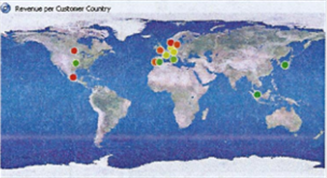
Once the actual data is fetched, the geographic data value coordinates are represented by coloring of the locations dots that are positioned to correspond with map locations, as shown below on this map of the world.
The following object shows a snapshot of a definition stage example for a Map Chart, before fetching the actual data with geographic locations. There are three selection lines on the definition stage of a map object: Top, Middle and Bottom.
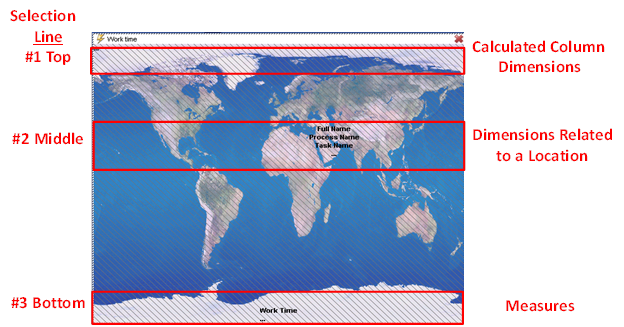
The first selection line (#1) is for dimensions which is located at the top of the map and it is currently empty in this example. This selection line is designed to add dimensions to the Map object’s underlying cross table, with the purpose of creating a calculated column.
The colors of the table entries in the rightmost (calculated) column are used for coloring the location dots. To learn more about Object calculations, see the Calculations Functions topic.
The second selection line (#2), placed in the middle of the map, is a selection line for dimensions. In this example there are three (3) dimension entries.
This selection line is normally used to place dimensions related to a location. Any dimension can be placed here, but in many cases they will not have a predefined location on the map.
The last selection line (#3), placed at the bottom of the map, is for measures.
