
Toolbar: ‘Create a new cross tabulation’
Smartpad: Properties Tab > Object Type
Smartpad: Properties Tab > Options and Formatting
The radar chart is a two-dimensional chart consisting of two axes with the Y-axis displaying the value range. The chart may display data from one dimension and one or more measures.
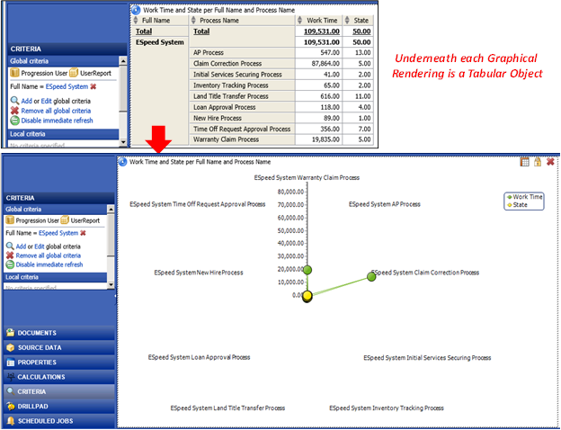
The following example illustrates the underlying tabular data that Analytics easily transformed into a Radar Chart (also called a Pareto Chart) rendering when the Radar Chart property button is applied to the selected Cross-Tab object, as shown below.
Note: With a higher quantity of data values present in the data source for all nine (9) labeled measures, the other missing spokes in the radar chart would be visible
The radar chart may be displayed by Analytics like any other chart from the Smartpad Properties tab, as shown on an object definition view below.
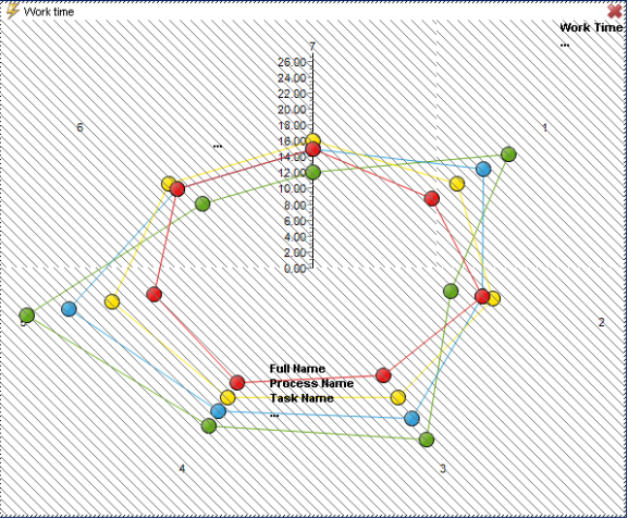
When a dimension is added to the chart, dimension members are plotted around the chart as a star-shaped or multi-pointed figure. This also limits the number of dimensions members being displayed in the chart, as too many members make it difficult to separate each member from each other.
The placement of the members in the chart depend on the measure value as members are placed farther from the center the higher the value is. The center value depends on the member with the lowest value and the Y-axis top value is adjusted to the highest measure value.
The following example illustrates one way Radar Charts are used for comparisons to better understand how they may be applied. In this example, a common rating scale [0-10] is used for all measures to make the three radar charts consistent in scale so that the comparative differences are easy discern as the user tries to efficiently understand: a vendor’s Technology, User-Base Sentiment and Market Impact ratings.
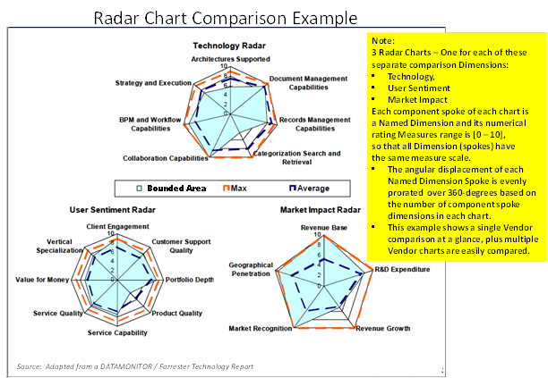
Likewise, the ease of comparison for similar sets of three diagrams for each of the different vendors being compared benefit from using the same rating measure and scale – Making visual comparison and assessment very effective
The recommended use for radar charts is to spot differences among a limited number of members in one dimension. The differences may be spotted among several measures, but a limited number of measures should be added to improve the readability of the chart. The variance among the data shouldn't be too big, since it is difficult to spot differences from member to member when one measure consists of values in the million range and another consist of values in the small thousand range.
As a general recommendation, use measures with the same format (e.g. currency, percentages, Rating Integer [0-10], etc.) in the chart to maintain readability; although it is possible to add measures with different formats.