
Toolbar: ‘Create a new cross tabulation’
Smartpad: Properties Tab > Object Type
Smartpad: Properties Tab > Options and Formatting
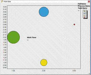
The bubble chart is basically the same as the scatter chart – the only difference being, that in the bubble chart, the points may have variable sizes depending on a measure value. The bubble chart, therefore, uses three measures: one for point sizes and one for each of the two axes.
 Measures be present in the underlying tabular object.")
The following Work Time object is rendered as an example of a Bubble Chart definition.
By default the X- and Y-axis will meet each other at point zero (0) and the axes top values will be adjusted to the highest measure values. Specific values for each axis may be defined in the Smartpad Properties tab.